I really enjoyed reading Chapter 7 from John Heskett's Design because it was interesting hearing about corporate identities and how much influence a simple logo design can have.
From reading this chapter, I learned that it is crucial that the logo or the image itself accurately delivers the message of the corporation and what it is that they strive for. Living in a society where we are always surrounded by numerous corporate logos, I feel like most people do not try to read too much into each and every one of them but it is amazing how big they are in our culture. I remember during class when Gabe had bits and pieces of different corporate logos, most of us were able to guess which companies they belonged to without too much effort. I feel like that shows how much these logos have achieved the status of being recognizable as an identity.
Chapter 8 was also neat to read about because it mentioned the Tokyo subway system and I was able to picture everything in my mind while reading the descriptions. Now that I think of it, they do have many accommodations for the blind. Since I have seen them many times from when I was a child, I never really thought about design being incorporated into it, but now that I think of it, I feel like this is another prime example of the definition of design and how it is done for others.
The Introduction of Cradle to Cradle was also intriguing because what I got out of it was that people are producing things that are supposed to benefit others but in the long run, it is not only affecting the people themselves but also the environment in a negative manner. I am really excited to read further into this book because to be honest, I feel like I might enjoy this more than John Heskett's Design...
Friday, April 29, 2011
Thursday, April 28, 2011
J05
Aggie:
"The fact that design is so much more than making things look pretty and unique or sleek and simple; it is ultimately for a meaningful human purpose on every level."
I definitely agree with this statement. Before, I though design was all about the outside appearance. Even after I learned that design is all about functionality, it still took a while for me to realize how much power design has when it comes to moving people. When someone designs for another person, it makes that person feel so much better because it lets them become more free :)
Avi:
When it comes time, I would like to move to an area that closely resembles an self-adequate ecosystem. I would like to do some more work on industrial design because I feel like I can develop a more eco-friendly system.
I totally respect Avi for wanting to develop a more eco-friendly system. During a time like this when the environment is at risk, I think it's great that there are many people like Avi who want to take charge and make things better. I also admire how something he enjoys will be able to benefit the environment!
Crystal:
My only question is why I haven’t seen these carts in stores nowadays? This video was from the 90s, so the shopping cart should have theoretically been improved somewhat since then.
I don't know about the U.S. but back in Japan, most grocery stores have shopping carts like that where you can put the basket onto the cart. It's much more efficient during check-out because instead of pulling each item out of the cart and placing it on the conveyer belt, all you have to do is place the basket full of items on the conveyer belt and it doesn't take as much effort.
Kristian:
On Monday we did the scavenger hunt, but more about it is posted in my blog. I found it exciting. The opportunity to "hunt" for design is amazing. I really like that we were not just sitting in the lecture room but exploring.
Just like Kristian, I really enjoyed how we got to go explore and look for designs that surround us on a daily basis. Walking around campus (or anywhere really), I never really stopped and thought about the designer of a building, the way it was designed, its possible functionality (I don't know if that's even a word but I'm going to keep on using it :) ) and such but through the scavenger hunt, I've become more interested in those things.
A04

This is my headband in the shape of a "C"

This is tape from CVS in the shape of a lower case "E"

This is duct tape in the shape of an "O"

This is my blow dryer in shape of the letter "L"

This is a silly straw? (I don't know what they're actually called...) but it has the letter "S"

This has the letters "U", "I" and "T"!!

This is my rainboot and it has the letter "X" all over the place!

This is my mug cup but if you focus on the white part of the handle, it makes the letter "P"

This is my roommate's shoe and it has an uppercase letter "H"

This is part of Donald Duck's mouth on my folder. It has the letter "V" in it.

This is from the Big Bang Theory poster and the girl is in the shape of a letter "Y"

This is also from another poster and the traffic lights make the letter "E"
Sunday, April 24, 2011
A03
My group:


Kristian: http://kboy123.blogspot.com/
At the beginning, we all looked up information for each of the clues to figure out which buildings the clues were referring to. Then, we went to each of the buildings to take pictures.
Clue 01:

This is Aggie sitting on the Barcelona Chair. The Barcelona Chair was designed by Ludwig Mies van der Rohe. There is the Children's Barcelona Chair which is 85% scale of the original.
Clue 02:

This is Kristian reading Azure magazine on the UP Round Lounge Chair designed by Gaetano Pesce. This chair is one of the chairs in Pesce's Up Series which consists of many interesting looking chairs such as...

Clue 03:

This is us chilling in front of the Wexner Center. The Wexner Center can be considered an important piece of architect for Eisenman because it was his first major public building that he had designed.
Clue 04:

This is the SEL and the building is very interesting because it has many arches all over the place.
Clue 05:

And last but not least, this is Thompson Library. The design team for this building was chosen through an architecture competition.
J04
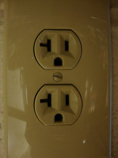
This was an outlet found in my bathroom. Gasp!!

This is the lock on my door.
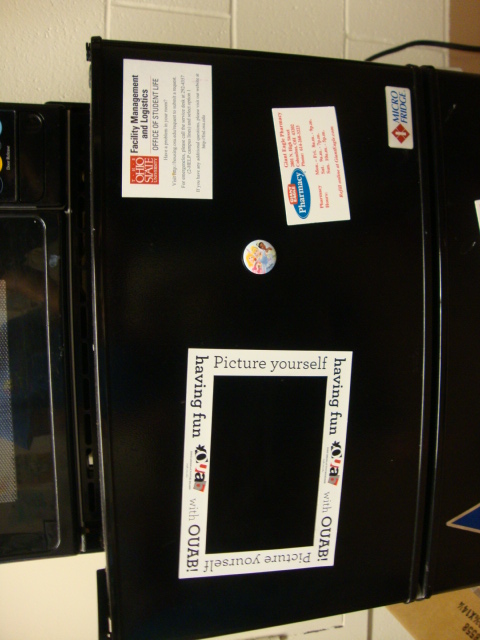
The magnets on my fridge were really placed like this! Another gasp!!

I'm just going to call this a fire extinguisher holder... Found on my hallway.

This is from my friend's guitar. It looks like it's sticking its tongue out :P

This is also my friend's XBox controller. It's frowning though... :(

This was from my friends' microwave oven. Double gasp!!

This is my friend's alarm clock. Ring-ring-ring!!

When I went to NYPD with my friends, I looked up at the ceiling and found this!

This is my purse. It looks silly :)

I got a happy meal... It made me smile too :)

Found on the elevator of my dorm.

Also found on the elevator of my dorm.

Random house and face by Giant Eagle.

I always thought cars had faces :)
Friday, April 22, 2011
CR02
I was a little surprised when Gabe pulled up the lecture slides on accessibility because I had just done one of my designer research on a company called Krabat who is all about accessibility for little children.
I had never thought about the relationship between "design" and "accessibility" because to me, they seemed like two different entities but now that I think of it, (as I always say) it makes sense!
Of course designers would be in charge of creating something for someone else and accessibility is a great thing for geniuses to come up with great solutions.
It was really interesting looking at all the different products that are out there which were created for accommodation.
Hopefully, even greater products will come out in the near future so that all people can enjoy things together :)
I also enjoyed watching all the TED lectures because they all focused on how design could be applied to the environment. The water-filter-bottle was especially awesome because that one product could help so many people who are in need of clean drinking water.
I feel like the recent lectures we've had certainly demonstrate the point of how design is all about other people and not just for the self.
Friday, April 15, 2011
RR01
Every time I started a new chapter in this book, it made me realize more and more how much culture influenced design. It seemed like that was the theme of this book (so far) and it was interesting going through all the different concepts while keeping ‘culture’ in mind because it made a lot of sense (another one of my epiphany moments J)
First, the toothpick concept was really neat to think about because being born in Japan, I was able to relate to Japan’s culture and the specific object. Japan is all about being polite and courteous and when it comes to eating, there are a lot of rules about manners that come along with it. Breaking of the top part of the toothpick for a toothpick rest is not only brilliant but it definitely goes along with the Japanese culture. I didn’t even know the top part had that function to it… I thought it was some grip support thingy… Oh the things we learn!
Second, living in Japan, I know how small those houses can be… They’re quite tiny compared to the houses you see here. And that is why design comes into place. I knew that the washing machine also had a dryer unit incorporated into it, but did I ever think why that is not the case in the US? Nope. But now it all makes sense. It’s design being applied to the specific culture and its nature of living. How interesting is that? I feel like there is so much to design and I am looking forward to discovering even more fascinating things!
J03
First of all, HI! to all of my 6 buddies: Aggie, Avi, Crystal and Kristian :)
It was very fun and interesting reading each of your blogs! Definitely got my mind stimulated!
Aggie:
"Looking at books and magazines and even walking around campus with Gabe talking about architecture opened up a whole new world to me...cheesy as it sounds. I have never given architecture even a thought but that day I was so observant and eager to hear more about how and why these buildings on campus were built the way they are."
When I read this part, I started nodding my head in agreement because I remember thinking the same way too. Especially with Knowlton Hall and the ramp. I never really knew that the ramp continued all the way to the top of the building. When I found out that the ramp was there for people with physical disabilities, it made me think about the difference between art and design; for yourself vs. for others.
http://agerhardt7design200.blogspot.com/2011/04/cr01.html
Avi:
"The consistency of the police cars give the image a feel where it could be possible for the trail of police cars could be infinite."
I really enjoyed looking at all of Avi's pattern photos but I especially liked the police car one! It just looks awesome. It almost reminded me of my bike rack pattern because they both show an actual thing/object repeating over and over again. I also liked how Knowlton Hall in the background has its own pattern going on. I just wonder what was going on that made this many police cars line up in front of Blackwell... Did I miss something...?
http://avistad.tumblr.com/post/4517382001/jo2-6-the-consistency-of-the-police-cars-give-the
Crystal:
"I think that Jonathan Ive is one of the most incredible designers there is and in my opinion, a genius. Apple is a prolific brand that consistently churns out innovative products that are unmatched in popularity and innovation. To be able to have a hand in all the products listed above is truly amazing .The simplicity of the products coupled with the top-of the-line technology is a formula for success."
I'm really glad Crystal did her designer research on Jonathan Ive because, honestly, I did not know he was the designer of all the Apple products (may have heard his name before in the past) and I always wanted to know who was responsible for them because they all look so neat! I've always been a PC person and I feel much comfortable using a PC so I don't really plan to get a Mac in the near future, but not going to lie, I do envy how awesome Apple laptops look compared to mine!
http://crystalscornerblog.blogspot.com/2011/04/assignment-2c-jonathan-ive.html
Kristian:
"I think that in our lives,design is very important topic and while combining it with the passion of learning new things,I can achive a lot."
I am very jealous of Kristian's talent :) I always wished I was good at something but I have always been pretty much mediocre at everything... Maybe design might be something I can be semi-good at :) I thought it was really neat that he had taken design classes from a very young age. And I really like the above quote; I think it is a great thing when your passion lines up with something you want to do in your life and I feel like that itself can motivate the individual to go above and beyond.
http://kboy123.blogspot.com/2011/03/about-me.html
Monday, April 11, 2011
A02
Long Response
Krabat is an industrial-design firm who creates products for children who have physical disabilities due to illness. The company itself consists of a managing director, marketing director, two therapists and a designer to ensure that the children receive full attention for a better way of living.
Krabat was first founded by Tom-Arne Solhaug and Fredrik Brodtkorb after Solhaug found out his son had cerebral palsy. Being a father of a son with such illness, he often found himself irritated with the lack of adequate assistance for children with disabilities. He saw that the many technical devices that were in need to aid his son and other children with physical disabilities were non-existent. This was the starting point of Krabat; he decided he needed to do something about it himself.
“No children are alike. Some are a bit different. Krabat is like that.
Our products help children to participate, play, make progress and achieve.
And give them pride in being different.”
The above statement is Krabat’s motto; what they believe and strive in whenever they come up with a new design for their customers. The people at Krabat understand how hard it is to see their children feel uncomfortable at a very young age being in wheelchairs while other children look at them in a strange way. That is why Krabat makes every effort to make sure that they design their products in such a way that the child does not have to feel self-conscious about the way they look to others.
The two founders, Solhaug and Brotkorb, are also engineers so they oversee the functionality of the product and make sure that it lets the child do many activities that most children have no problem doing on a daily basis. Along with them are the two therapists, Kristin K. Jahren and Ann-Helen Gomnæs, who understand the impediments of having a physical disability and with that, they assist the engineers and designers in developing a product that will most benefit the children in every way possible. Last but not least, Andreas Langdalen Sørensen is the designer/technician who is in charge of designing the product and making sure it looks appealing to the child as if it were a toy instead of some dull mobility aid. As a team they make every effort to make sure that the end-product is something that the child will enjoy using and will assist him or her in doing things that are often limited to them.
Krabat is in a unique situation that lets them do as much as they can for these children. With the Norwegian health care system, expensive medical equipment are bought through the health care system and then are lent, sometimes permanently, to people who are in need. Thus the company itself does not have to worry about cutting their budget when developing a product for customers who may have a hard time affording them. Since they do not have to worry about the cost, they can concentrate on creating the best product that benefits the children.
Krabat has already had success in making sure that the child appreciates their product. Solhaug’s son, Kasper, who just turned eight, happens to adore his Pirate, which is a floating device that helps children swim independently in the water. When other children ask to borrow it, he simply answers no. Krabat’s product has helped children become more confident about themselves and raise his or her self-esteem when dealing with their disability which is ultimately the goal of this company.
I chose this company because I thought it was a very inspiring way of design being applied in the society. I hope the company will come up with more mobility aids in the near future so that more children can feel good about themselves J


Short Response-1
Paul Rand was a very famous graphic designer responsible for the logo designs of many successful companies such as IBM, UPS and ABC. Random fact: his real name is actually Peretz Rosenbaum but his name was changed to Paul Rand to hide his Jewish identity. “Paul” came from a nickname for Peretz and “Rand” came from his uncle.
He was born and raised in Brooklyn, New York. As a child, he had started to become interested in art and he often painted signs for his father’s grocery store and for school projects. Even though he enjoyed art, he was unable to convince his father about his passion for the subject. For that, his father made him attend academic school during the day while letting him attend classes at a Pratt Institute during the night. Even though he attended art school, people saw him as a “self-taught designer.”
His designing career began with a part-time job of graphic designs for magazines and newspapers. Eventually, his career had begun to pick up speed to the point where he became famous internationally. When he worked for Direction magazine, he did his job for no pay because they let him do whatever he wanted artistically.
His IBM logo in 1956 was ultimately the highlight of his career bringing him attention from many people. Mark Favermann describes Rand’s IBM logo as “was not just an identity but a basic design philosophy that permeated corporate consciousness and public awareness.” From there, he established his status as one of, if not, the greatest graphic designer in history.
Paul Rand’s designs intrigue me because they are all very simple but they still carry meaning to it. For example, the former UPS logo has a picture of a present on top of what seems to look like a badge. From my interpretation, it seems like the logo is saying “we will deliver your package with care and diligence.” From his works, I learned that pictures can sometimes carry so much more meaning than just words. I also like his modernish style and that is something I am interested in.


Short Response-2
Karim Rashid is a very prominent designer whose work ranges from furniture to fashion to packaging and so much more. Statistically, he has “over 3000 designs in production, over 300 awards and working in over 35 countries attest to Karim's legend of design.”
He has had a definite passion for design which led him to study in Canada and Italy for his graduate design studies. Some of the companies he has worked for in the past are: Tommy Hilfiger, Citibank and Sony. He often visits many schools as a guest speaker to share his ideas and concept about art and design. (Random fact: his work has been exhibited at our very own Wexner Center of OSU in the past).
There is something called the “Karimanifesto” which is Rashid’s view on art and design. He believes that “Design is about the betterment of our lives poetically, aesthetically, experientially, sensorially, and emotionally. My real desire is to see people live in the modus of our time, to participate in the contemporary world, and to release themselves from nostalgia, antiquated traditions, old rituals, kitsch and the meaningless. We should be conscious and attune with this world in this moment. If human nature is to live in the past - to change the world is to change human nature.” From Googling images of his work, I feel like I can see his Karimanifesto being formulated into his work because many of his work seem futuristic; definitely the opposite of traditional (which is why I chose to do my third research on him). I really like his way of design because they are very fun to look at. Even a simple chair looks so high-fashion and it makes me imagine what the world may look like in the future. By designing products in such a way, it seems like he is trying to push people to think in a new way instead of being tied down to old, traditional ideals.


Works Cited
"Biography." Karim Rashid. Karim Rashid, n.d. Web. 11 Apr 2011. <http://www.karimrashid.com/biography_fr.html>.
"Business Idea." Krabat. Krabat, n.d. Web. 11 Apr 2011. <http://www.krabat.com/krabat_forretningside.htm>.
"karim rashid." designboom. designboom, Feb. 2002. Web. 11 Apr 2011. <http://www.designboom.com/eng/interview/rashid.html>.
"Karimanifesto." Karim Rashid. Karim Rashid, n.d. Web. 11 Apr 2011. <http://www.karimrashid.com/biography_fr.html>.
"Paul Rand: A Brief Biography." Paul-Rand.com. N.p., 2007 April 11. Web. 11 Apr 2011. <http://www.paul-rand.com/site/biography/>.
"Product Philosophy." Krabat. Krabat, n.d. Web. 11 Apr 2011. <http://www.krabat.com/krabat_produktfilosofi.htm>.
Shonquis Moreno, Shonquis. "Blazing Saddles."Metropolis 15 March 2011: n. pag. Web. 11 Apr 2011. <http://www.metropolismag.com/story/20110315/blazing-saddles>.
Friday, April 8, 2011
J02
For Journal 2, my friend and I decided to go on a little stroll across campus to observe natural and human-made patterns. It was a pleasant experience because not only was the weather gorgeous, but it was fascinating looking at all the different patterns that surround us on a daily basis. (FYI: I personally define the word “pattern” as anything that occurs repeatedly/continuously)
1: This was the first picture I took outside as one of my patterns. I chose to take a picture of this because the tiny, light green buds that were bursting out of the ground really reminded me of how spring was finally arriving. I found this near McPherson Lab.

2: Honestly, I do not know the name of this building but I took a picture of it because it reminded me of the Bauhaus from our first lecture. The moment I looked at it, I focused on the flat roof and the repeating windows with the semi-large sheets of glass.

3: This was something that my friend had pointed out as a pattern. Without her, I would have ignored it completely. This was found nearby the Oval and I personally like it because even though they are just bike racks, they seem very modern and simple.

4: These flowers belong to one of the trees found in the Oval. My friend and I really like it because it was one of the few trees (or maybe the only one?) that had flowers blossoming from it. And it smelled very good. I call it, “floral patterns.”

5: This one is another one of my favorites because I definitely like patterns that have to do with water. Even though Mirror Lake may have the most disgusting things deep down, the waviness and the sunlight shining down on the water made it look very pleasant J

6: This is the front door to the Faculty Building. I just thought the design of it was very intriguing because of all the geometric madness going on. It just looked really fancy and I especially like the handle part and how it comes together to make one big circle.

7: Another pattern I really liked for a random reason would be this one. I found it on the sidewalk by the Oval and it just reminded me of Legos. And I like Legos… And when I looked at it, I thought, “Wow, this is what design is all about!” It’s bright red and made with rubber so that everyone knows that they need to stop here before the crosswalk. (Probably sounds a bit stupid but) It was one of those epiphany moments.

8: A picture of a bush that can be found anywhere on campus (thus I do not remember where I found this specific bush…) However, it just reminded me of when I was a little child because I remember pulling the leaves off and mixing it with other leaves and flowers and pretending as if I were cooking. It was simple fun and I kind of want go back and do it again J

9: This is the amphitheater by Mirror Lake. My friend and I just stood at the bottom and took a picture looking upwards. Even though they are just layers and layers of stone, I thought it was neat because it reminded me of the Renaissance Period and I just thought it looked fancy.

10: The way Thompson Library is built makes it look so scholarly (even though I am not completely sure a building can look scholarly…). Just in this picture, I can see numerous patterns. The windows, the pillars, the railing, the part above the doors. This probably will not make any sense (just like the all the other things I post on this blog) but the patterns I just listed above have greater magnitude to it compared to the bike rack pattern for example and I think that is what helps make Thompson look so awesome J

Subscribe to:
Posts (Atom)